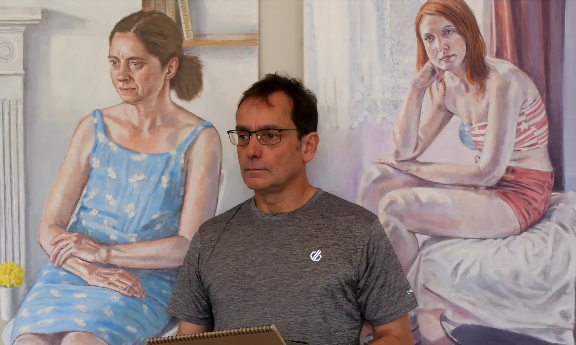
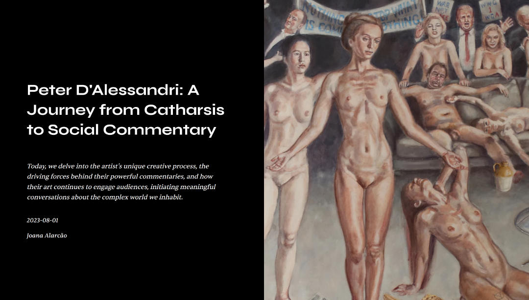
I had the pleasure of being interviewed by Joana Alarcão for the online magazine Insights of an Eco Artist. I must admit that it was harder work than I expected. I’ve given a few interviews in the past and usually the questions are predictable, generic and a little boring. So I was a little surprised to be sent some more challenging questions specifically about my art practice.
I’m not sure how many people read these interviews, but I always find it a useful exercise trying to explain my art practice to someone. The interview can be found here.
Joana Alarcão is an interdisciplinary eco-artist and writer who works primarily within the concepts of social/environmental justice and culture. Her website is here.
A few years ago I gave an interview to the naturist magazine Clothes Free Life. Somehow I managed to delete the original blogpost about it. It was an interesting exercise as the questions were from a different perspective to your normal artist interview. So here is the link to the article:
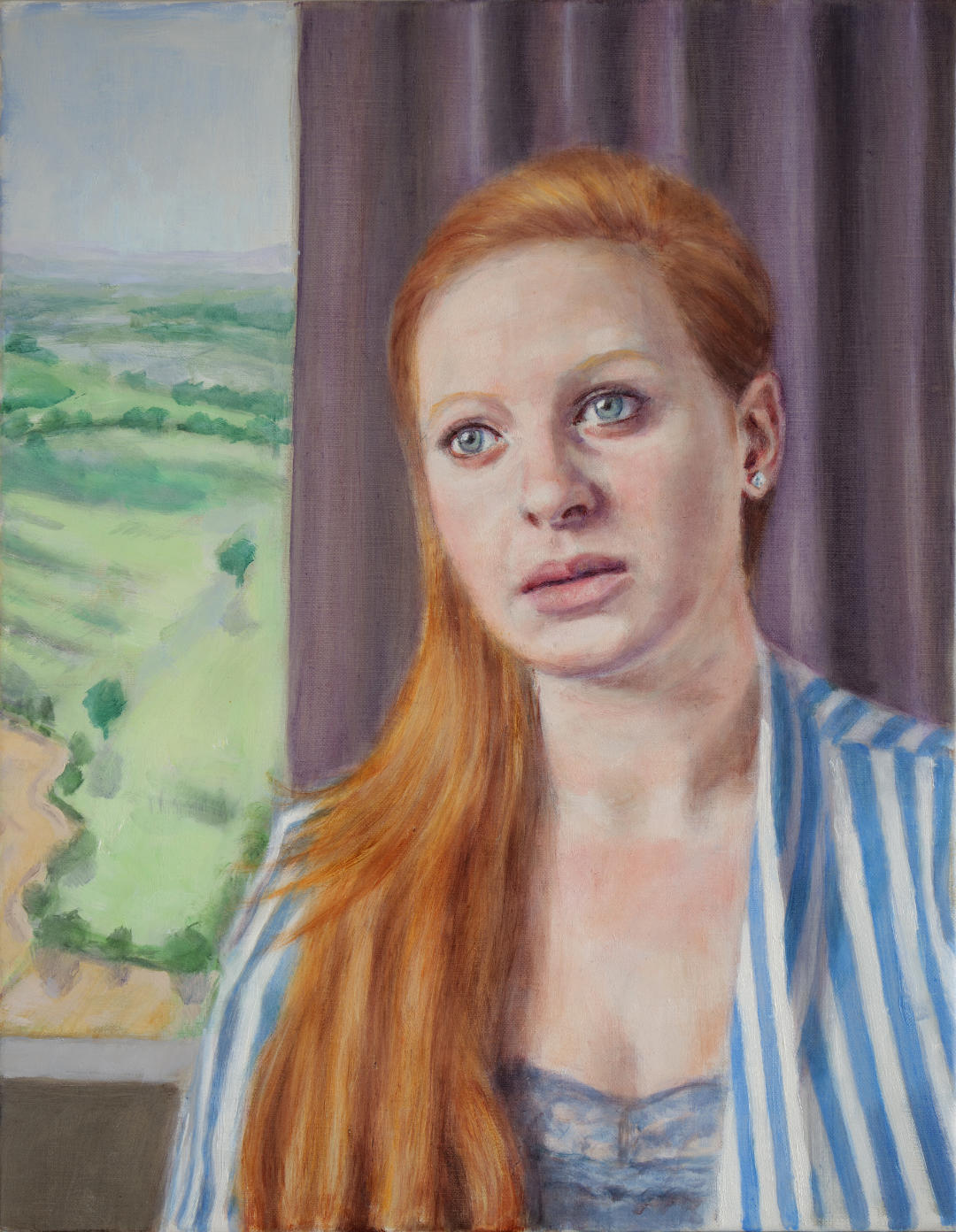
Several years ago I had the pleasure of having a young singer/songwriter by the name of Devon Mayson pose for a portrait sitting. This was just one of a series of portrait sittings I arranged at the time, all with different sitters. They went well, and I recall Devon in particular was fascinating to work with. But at this time I chose instead to concentrate on figure studies and my Relationships Series paintings, so the drawings and photos from these sessions have remained unused. Until now. In the past few years portraiture has become a much more important part of my art practice, and so I have been taking another look at the reference material from these earlier sittings.
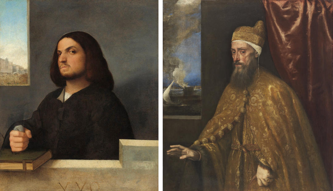
This is a portfolio piece, to demonstrate my skills to potential customers, and also to give them ideas for what they can have in their own portraits. This is an example of how the introduction of a landscape in the background can add visual interest to a portrait. It is a device I have used frequently in commissions – the main risk is that it can distract your view from the sitter. It was sometimes used to good effect in Renaissance portraits. Artists like Titian would usually set the sitter within a neutral, abstract space – possibly for economy. However the addition of a window view, as in the examples below, opens up the space and adds an extra meaning to the portrait..
Two examples of Renaissance portraits with window in background
If you are interested in commissioning a portrait, please don’t hesitate to get in touch. My email address is on my Contact page. I have also produced some portrait case studies which might be helpful – they are below this blog post.
The model for this paintings was singer/songwriter Devon Mayson. From her website:
“Devon is a singer, songwriter and instrumentalist whose unique style is shaped by influences from the musical worlds of Country, Folk and Pop”
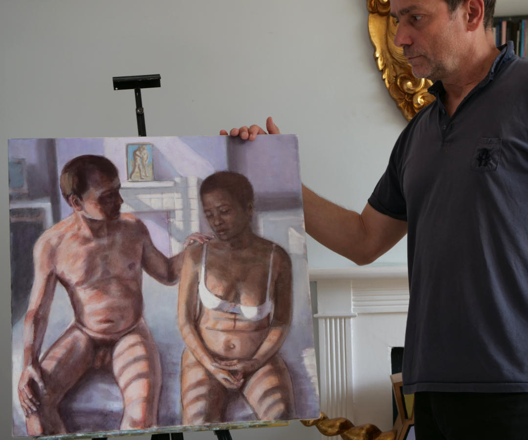
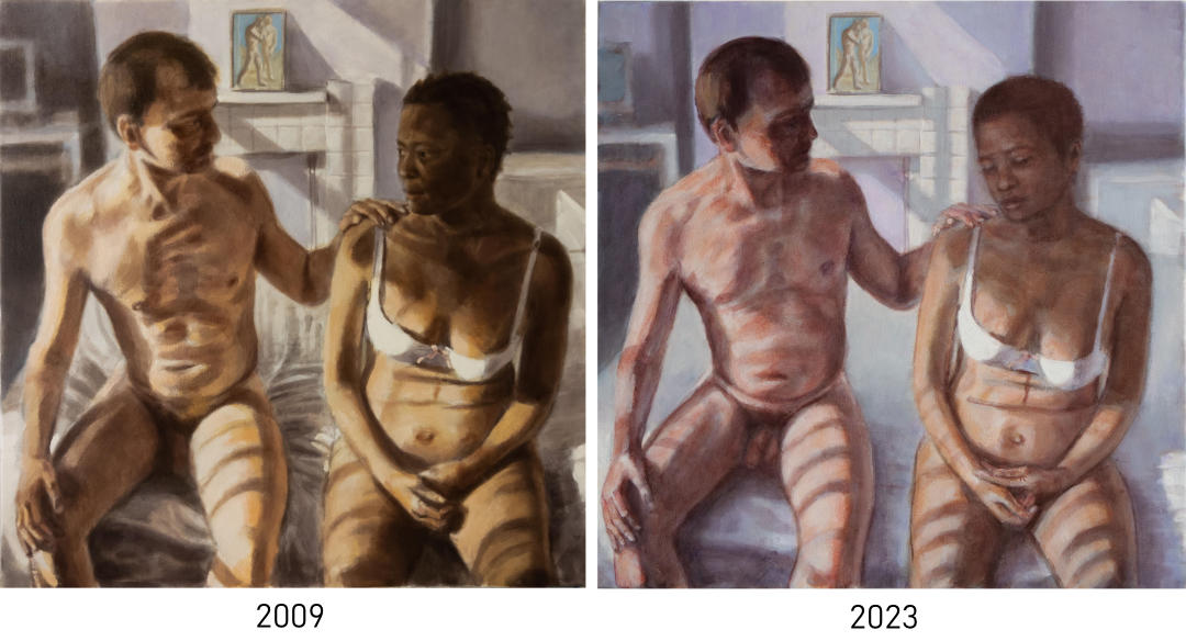
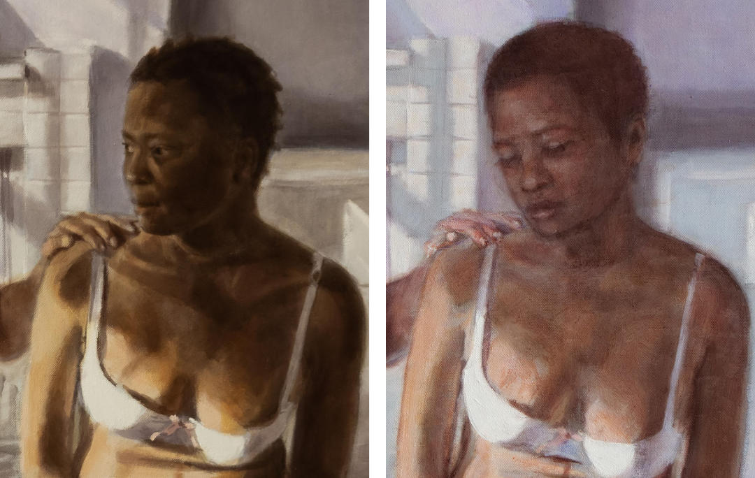
“Man and Woman” is a painting that I thought was finished over ten years ago. I’ve suffered years of nagging doubts, and a real reluctance to show it publicly, such that I finally decided to rework it. It was only going to be a small amendment, but in the end I had to repaint the entire surface.
It’s debatable about how much the revision is an improvement. The poses are almost identical. Some people might prefer the earlier version. That’s irrelevant. I feel that the later revision is much closer to the painting that I tried to produce in 2009. Although the original version was no doubt true to the reference photos I was working from, I don’t think it captured a true likeness of the female figure.
I should explain something about the background to this painting. My partner had just passed away after a long illness, and in a splurge of activity I set about working on a series of paintings that recorded my lost partner and our relationship. Most had been planned while she was still alive (I had taken reference photos and made preparatory sketches), but sadly her poor health meant I was unable to work on them at the time. This was the last of that series, and for some reason it was the only one I was unhappy with.
The problem with resuming work on a painting after such a long time is that my painting technique has changed over the years. I still start with a monochrome underpainting, but my palette of colours has changed considerably, I use different mediums, and my use of glazes has become more restrained. Nevertheless it was an interesting exercise. The photo below shows a lighter palette in the revised painting.
Another interesting aspect of this exercise is that I no longer have the original reference photos. Much of the work on my late partner’s face was done from memory, which would normally have been outside my comfort zone. One area where my painting has changed is that I am less beholden to reference photos, and feel more confident to wander off track. I believe that I have achieved a better likeness here by doing just that. In writing this post, and looking at photos of the two versions side by side, it does feel like a lot of work for only a small change. But it was worth it. I feel happier showing it now.
Edit: “Man and Woman” has since been shortlisted for the LGC Art Prize 2023 A recent post about the competition can be found here: LGC Art Prize
I have collected some case studies of recent portrait paintings, detailing the decisions that had to be made in planning each painting. I hope they might be useful to anyone thinking about having their own portrait painted.
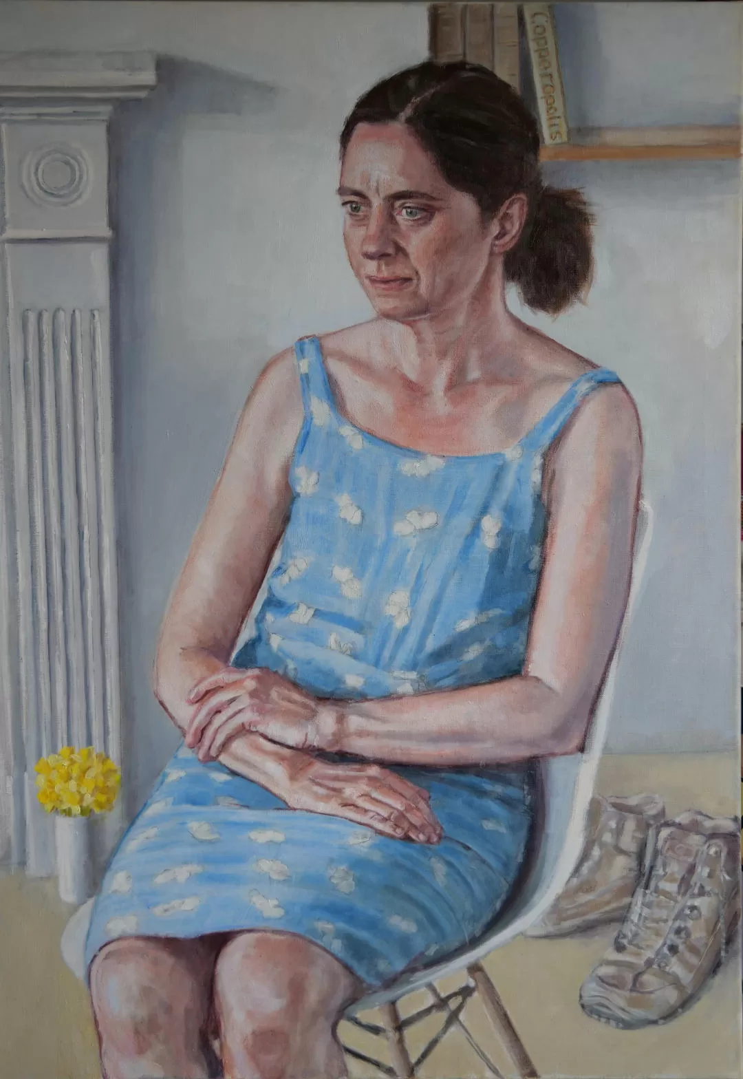
Portrait Case Study 1. The Blue Dress
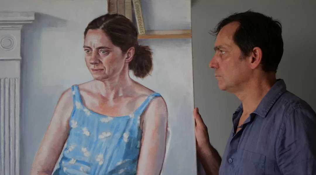
Size and pose: This is quite a large portrait, at over 100cm tall. Given that we quickly agreed on a large canvas, it was then a choice of choosing between a full length or 3/4 length pose. We worked through a variety of standing and seated poses, finally agreeing that this seated position looked best. We paid great attention to the placement of the hands – trying to avoid them looking awkward, while also looking interesting in the final painting. Apart from adding greater visual impact, this size canvas does allow for working in greater detail on the whole figure and on the clothing.
Style and clothing: We were limited by the chosen date for the sitting being a blazingly hot summers day, so a loose summer dress seemed the most comfortable option. It wasn’t the first dress pulled from her wardrobe. We considered quite a few options, and in the end agreed that this dress looked nice on her and would add some interest to the painting.
Setting: Ordinarily I liked to have sitters pose in their home environment. Apart from being more comfortable, the decoration and furnishing of a room often says something about the sitter. In this particular case the sitter had just sold their old home and was staying in rented accommodation, awaiting a move to their new home. So this bland Airbnb flat certainly didn’t say much about the sitter, but it was a suitably bright and blank backdrop. I chose to include some of the fire surround just to add some visual interest, and to help set the sitter in space.
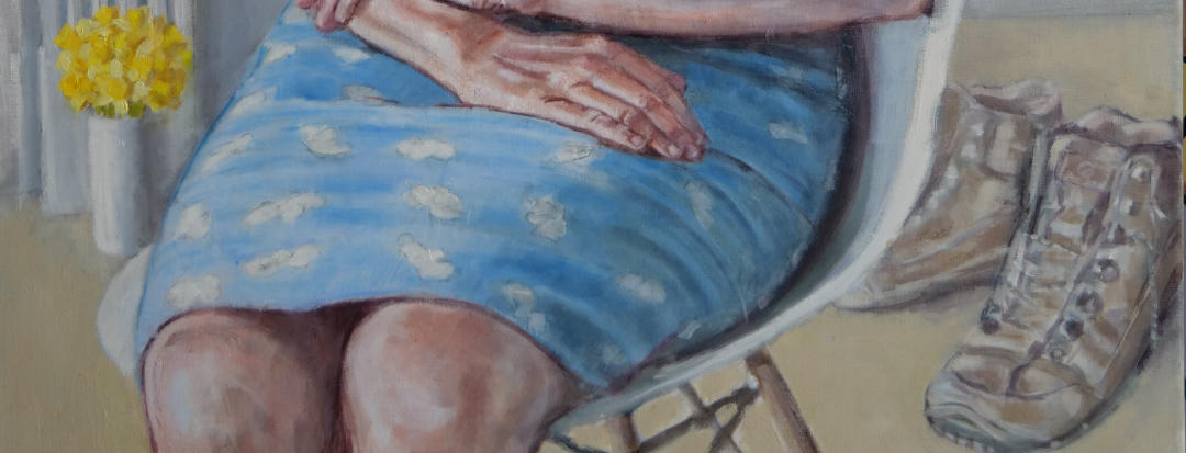
Props: The items in the background (shoes, book, flowers) were added later, and weren’t part of the original brief. As I worked on the painting, I felt that there was a lot of dead space in the background that wasn’t doing anything. I also was not fully aware during the sitting what a pivotal time this was in the sitter’s life, and I felt I should include something (spring bulbs) to suggest the fresh start the sitter was experiencing. The boots and book are indicative of her great interests. I could have thrown in lots more, but I did not want the props to distract from the figure.
If you have any questions about commissioning your own portrait, please don’t hesitate to get in touch with me. My email is on the Contact page
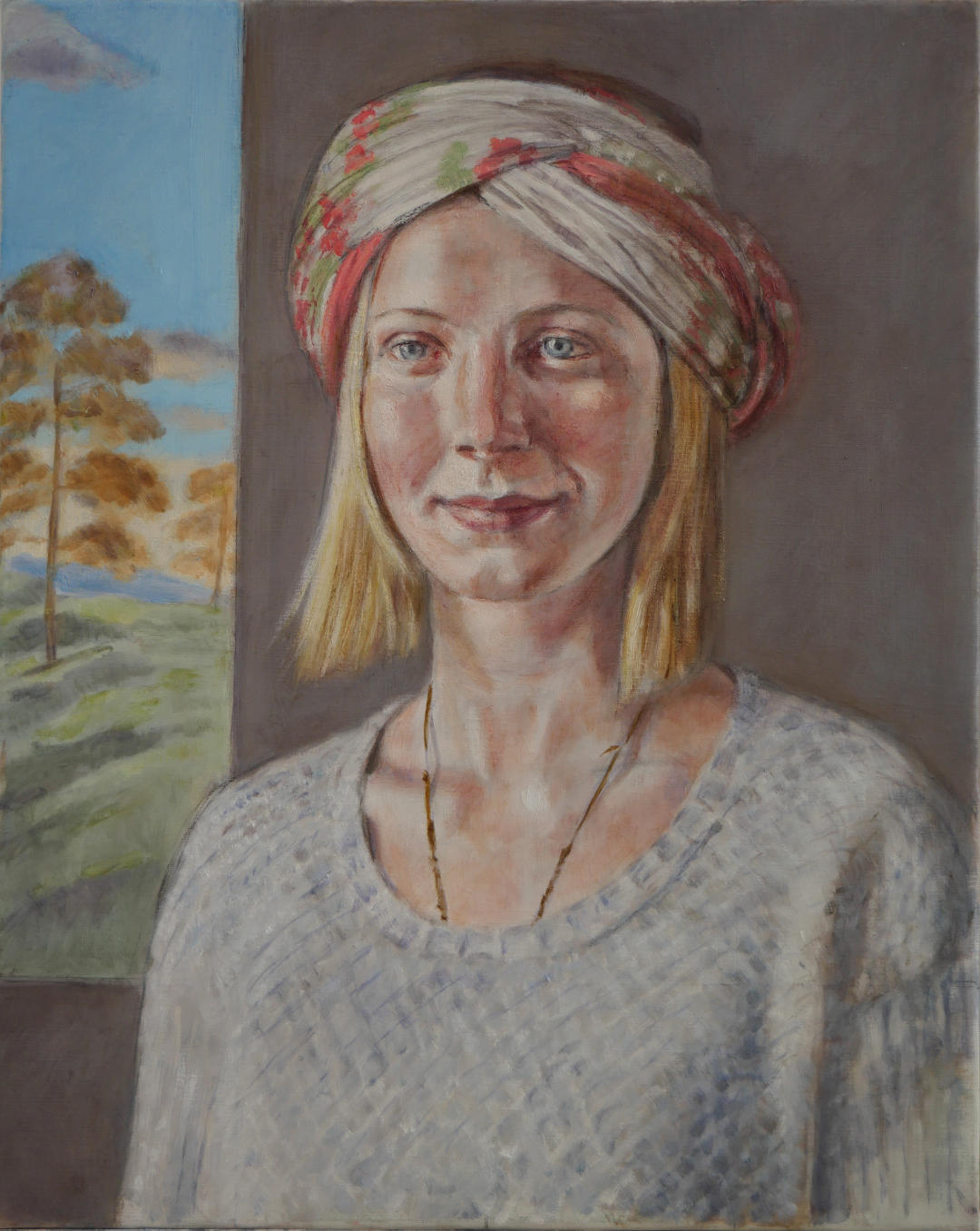
Portrait Case Study 2. Renaissance Garden
This is not actually a commission, but was painted as a portfolio piece – a painting that I could show to prospective customers and take along to art fares. In the event, it was snapped up by a collector shortly after I finished it, so now I only have the photos to share with you
Canvas Size: I chose a 50cm x 40cm linen canvas for this painting before I even started. It’s quite common to start a commission with a decision about the canvas size. It might be to fit in with your budget (larger paintings will incur more costs), but more often it’s because most people have limited space to display artwork. This particular linen has a very nice surface for portraits; although the weave is still visible, it’s less intrusive than cotton canvas. The smoother surface allows for more detailed work.
Pose: I worked through quite a few different poses with the sitter. She had a wonderful calm demeanour about her, which I wanted to capture in this painting. Having already decided on the canvas size, I was limited in my selection of poses. A full body pose would have meant her face would have been quite small on the canvas. I find this size ideal for a head and shoulders portrait, being large enough that I can introduce quite a lot of detail in the face. We went through different poses with arms crossed, or the model sitting. In the end I chose this standing pose. The model had such excellent posture, and that wonderful poise, that I wanted to try and capture it with the simplest of poses.
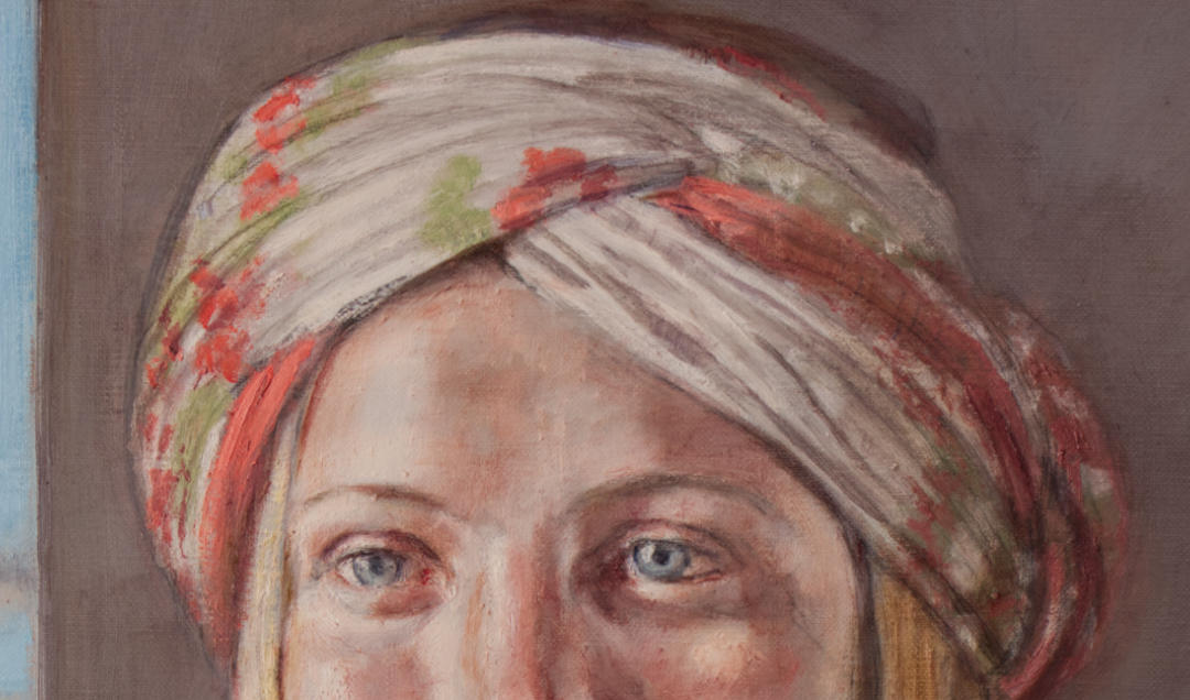
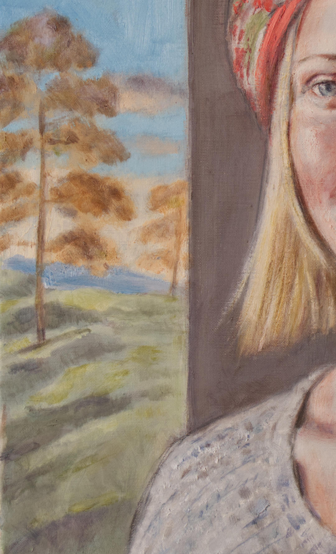
Style and clothing: I asked the model to select her own clothing, giving consideration to how she wanted to be portrayed. She arrived wearing a colourful headscarf and loose knit jumper, which suited her well. The jumper provided a nice contrast in textures, which worked well in the finished painting.
Background: I initially planned this portrait with just a plain background, but I quickly realised there was a timeless quality about this model, which got me thinking about Renaissance portraits; where they might sometimes introduce a section of landscape in one of the top corners. This was a useful device to add depth and perspective to the composition, while also adding colour and visual interest to the painting. I was more interested in the latter, and how a serene vista would complement the model’s calm manner. I also wanted to demonstrate how alternative backgrounds can be easily introduced into a commissioned portrait.
Props: No need for props with this portrait. The smaller canvas didn’t lend itself to being cluttered with objects. With similar commissions of this size the sitter has asked that they be painted wearing a particular piece of jewellery, which was of sentimental value.
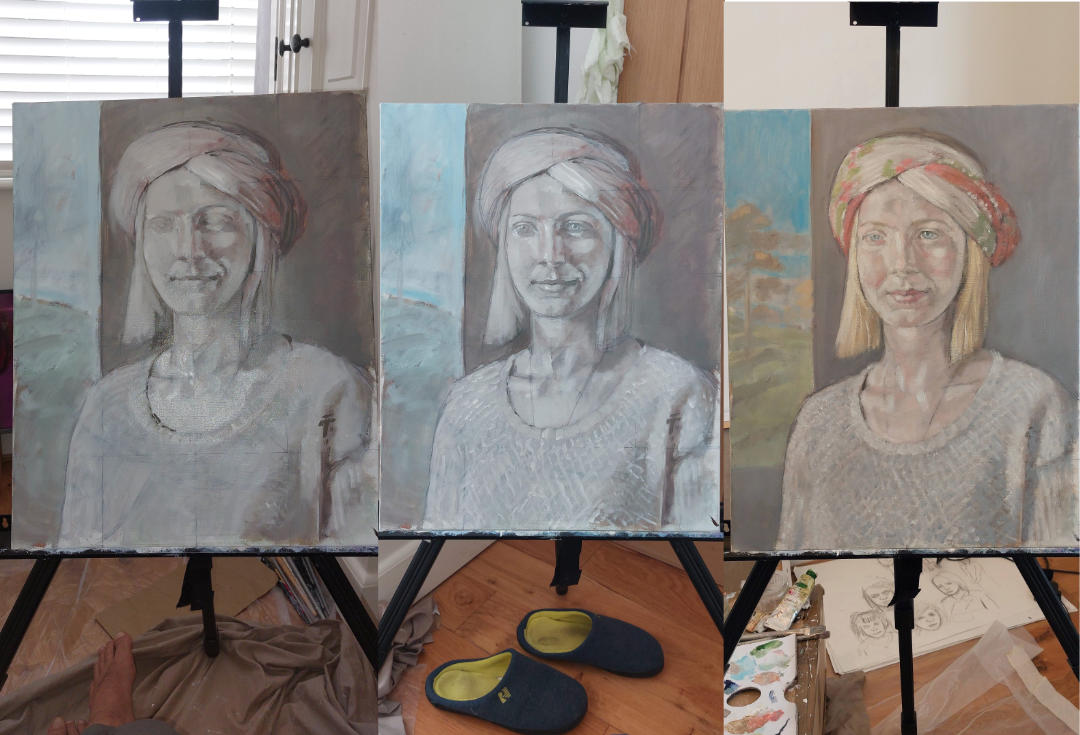
Progress photos, showing the monochrome underpainting.
Painting technique – Glazes and underpainting
The photo above shows the painting at three different stages. I had already worked out the composition on paper, with preparatory drawings. The underpainting is painted with a monochrome or very restricted palette. Once I was happy the tonal values were correct, I introduced colour into my palette. The final photo above shows the painting just before I add the colour glazes. It’s a traditional technique can add a wonderful luminosity to the highlights, and a depth of colour to the shadows that simply cannot be achieved with other techniques.
I have written a blog post about my use of glazes. You can find it here: Glazes and Underpainting
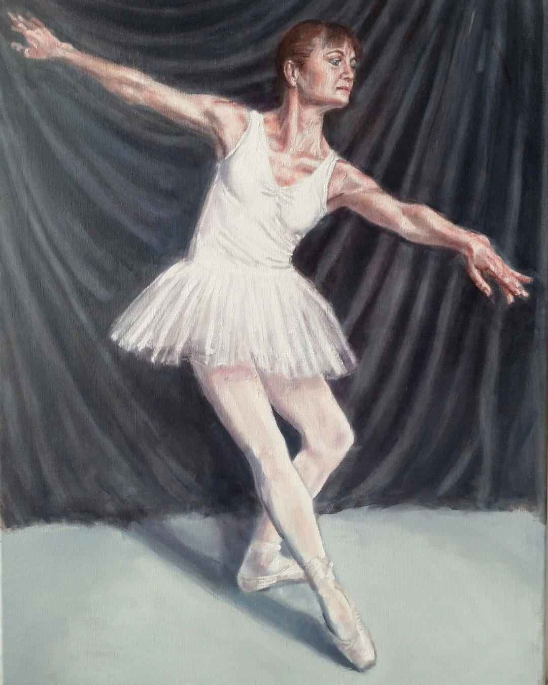
Portrait Case Study 3. The Dancer
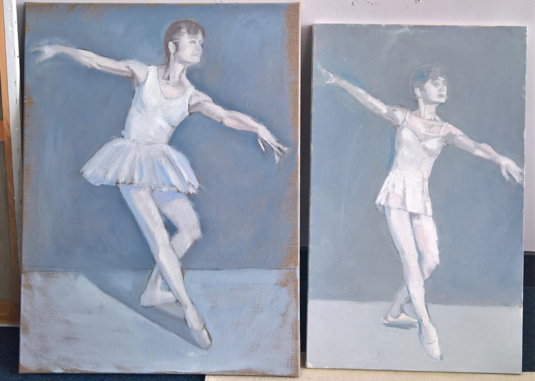
This was a challenging commission. It taught me a lot about ballet, and also about specific problems in painting “action” poses. I was approached by a ballet teacher who wanted a portrait of herself in a recognisable dance pose. Being a lifelong admirer of Degas’ wonderful paintings of ballet dancers (here’s an example at the Met), it was a commission I couldn’t refuse. I was concerned that my studio would not be big enough. Although fine for portraits, I felt it might feel cramped if she started throwing her arms and legs around. Despite my suggestion to have the sitting at her dance studio, she preferred to come to my studio.
Problems holding a pose.
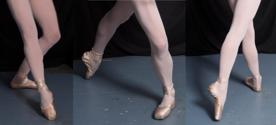
The first problem I encountered was that it proved difficult to hold any dance pose long enough for me to produce a useful drawing. Gestural charcoal sketches were okay, but the more detailed drawings I like to produce were not possible, and the sitting became quite a challenge for the both of us. I can see why Degas favoured pastels. As soon as I had enough sketches, I suggested my client should run through her repertoire of ballet poses, and I would start taking photos. She looked through the photos every now and again, and we would adjust the poses accordingly. Apart from the different poses, we also tried different outfits. In the beginning the tutu was my least favourite outfit and I couldn’t see it making it to the final painting. By the end of the sitting we had lots of photos of various ballet poses carried out in three different outfits. My client checked through them, pointing out any where the pose was not up to standard, and then I undertook to work up some sketches from the remaining photos, offering some alternative layouts.
A choice between two poses and outfits
I couldn’t find the original sketches, but did manage to find photos of these later oil sketches. We had already eliminated alternative poses, and I offered my client two slight variations of this pose. Although I hadn’t been keen on the tutu at first, by this stage I felt it looked the better outfit, and made for a more balanced composition. Also the pose on the left looks that little bit more dynamic.
What did I learn? Ballet instructors are very demanding about their dance positions being spot on. I got into trouble with some wonky arms in my first sketches. Second, although I’m very happy with how the painting turned out, I still feel that it would have added extra visual interest if it was set in a dance studio. Finally, if I’m presented with a similar dance challenge in future, I would forgo my usual preparatory sketches, and would instead video the sitting while taking photos. I think that would be a more useful record than my charcoal sketches. I have started to use video even with my traditional portrait paintings (especially when the sitter can’t pose in person), as it can sometimes give a better sense of what the sitter really looks like.
If this article has given you the inspiration to commission your own painting, don’t hesitate to get in touch with me – use the email address on my Contact Page.
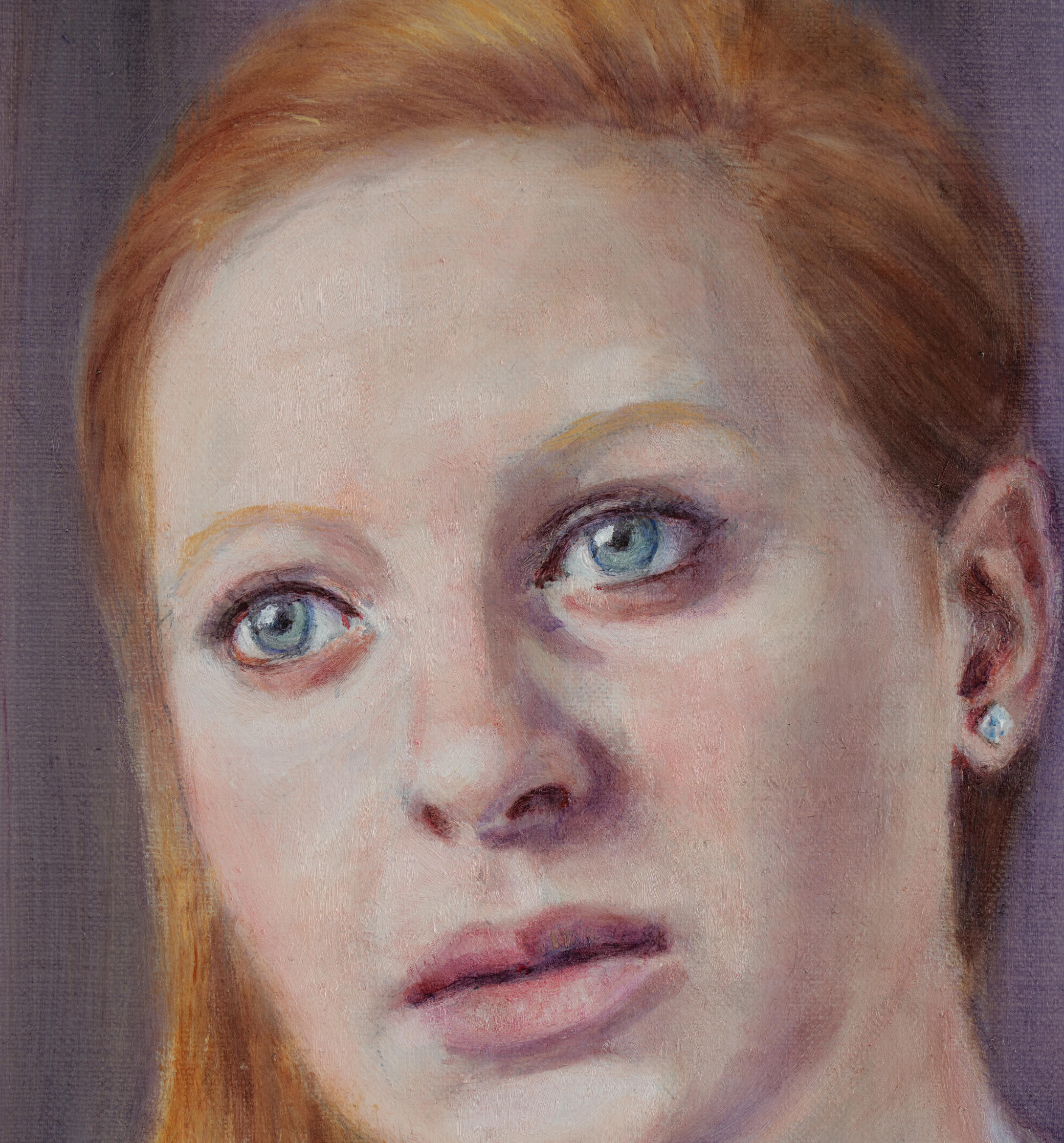
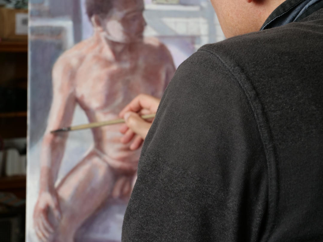
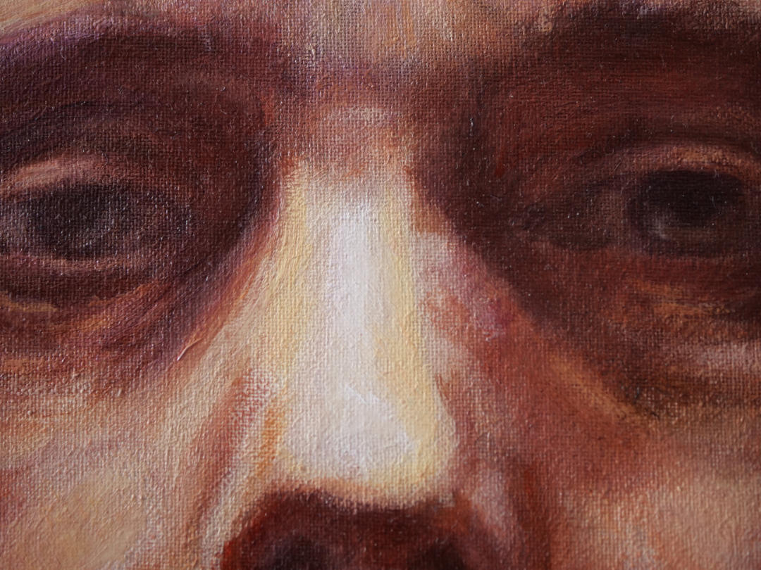
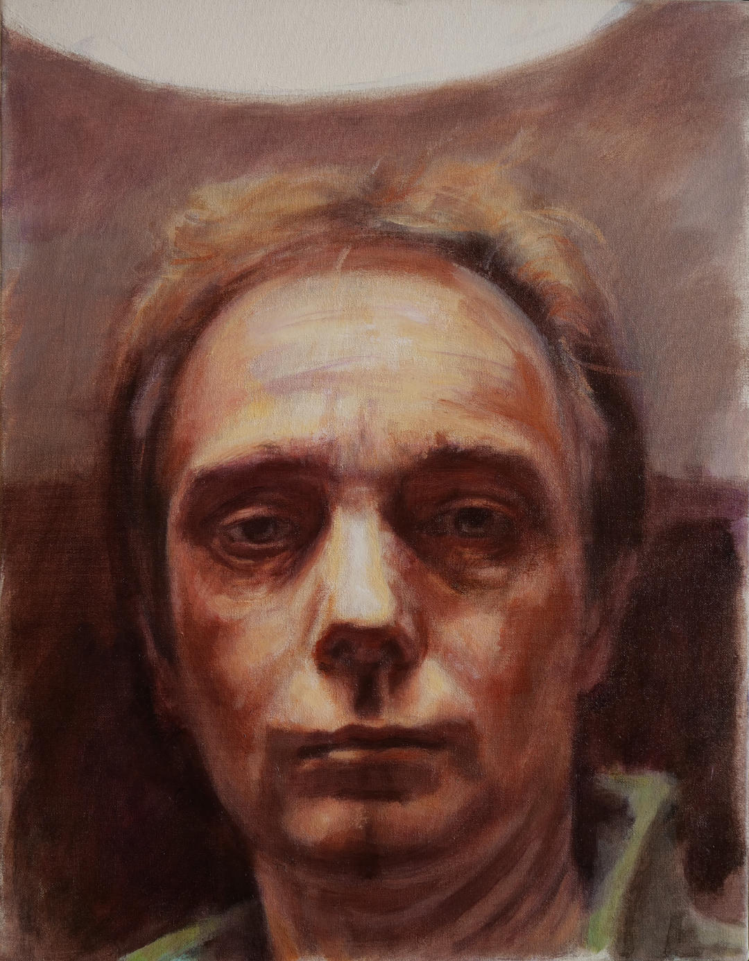
A recent visit to the Rijksmuseum in Amsterdam compelled me to rework an old painting. It was the Rembrandts that did it. I painted my self-portrait “Halo” during a particularly difficult time in my life. I had become the carer for my terminally ill partner. People praised me for my fortitude, but I was aware of a disparity between how people saw me and how I truly felt. Deep down there was an awful darkness; a sense of despair. I tried to recreate this sense in a painting, but wasn’t completely successful.
detail from reworked painting
Anyway, fast forward to March this year, and I had a splendid time visiting Amsterdam and studying the Rembrandts at the Rijksmuseum. Although there’s a very good selection of Rembrandts to be seen in London, I was captivated by the examples in Amsterdam – some really fine late Rembrandts. I could stare at them for hours. I marvel at the detail he could suggest in the shadows, with such economy. And there was such a sadness in those eyes. In looking at these wonderful paintings by the great master of portraiture, I felt a desire to revisit one of my earlier self-portraits: “Halo”.
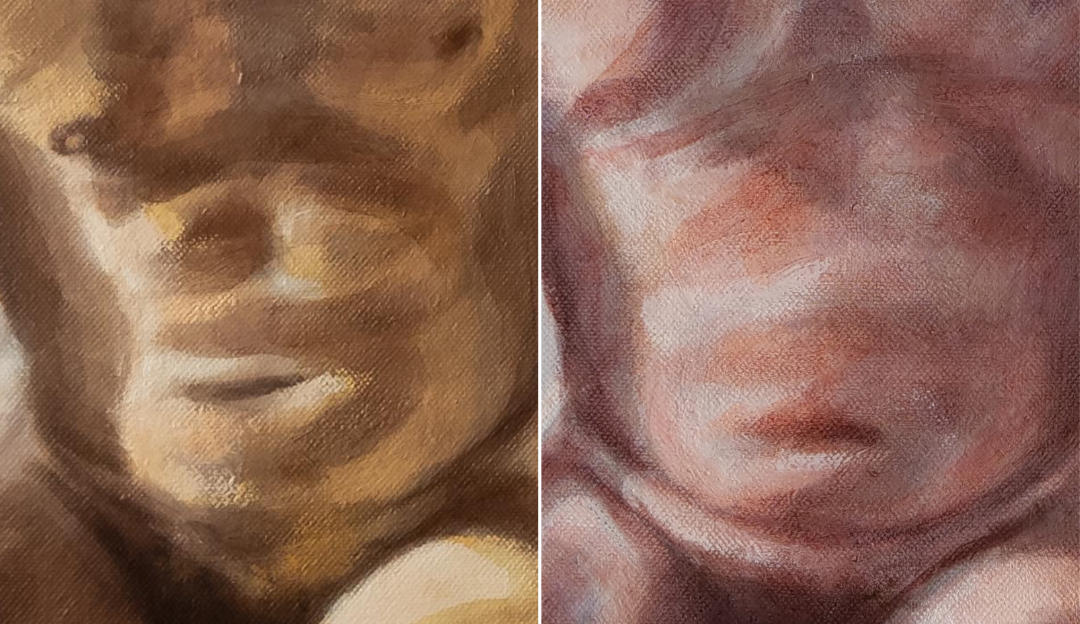
Halo, revised version
I didn’t undertake many changes. Basically I added a few more layers of glaze, but this time I was a bit looser in the application and removal. It is easy to fall into the trap of becoming too precious when applying glazes. It’s the final stage, and the underpainting might have taken many hours to complete, so there’s an obvious reluctance to mess it up with a sloppy final layers. But looking at those old Rembrandts, what struck me is the spontaneity of the most beautiful passages in his paintings. He wasn’t afraid of messing them up.